Quick answer
Clear acrylic is useful when transparency and polished edges are part of the design. Frosted acrylic can soften glare and add contrast. Colored acrylic creates stronger brand impact, but its opacity and edge appearance should be reviewed against the product application and artwork.
Choose a finish for the viewing environment
Consider background contrast, lighting, fingerprints and how the object will be handled. A retail display in bright light may need different contrast from a desk award viewed at close range.
Use samples for colour and transparency
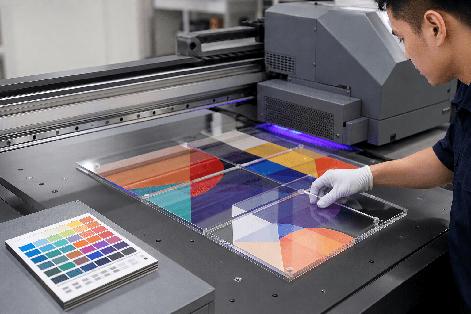
Colour on screen is not a material specification. Review a physical sample with the intended print, engraving or insert before approving a finish for a brand-sensitive project.
Balance appearance with production
Layered clear and coloured pieces can add depth, while more layers also introduce alignment and assembly considerations. Confirm visible edges, adhesive placement and protective packing during the sample review.
Production and delivery checks
Before production, agree the artwork revision, material, finished dimensions, decoration, packing and the conditions that matter to the product application. During production, factory testing should focus on the approved sample and measurable customer requirements. Before dispatch, shipment inspection should confirm finished quality, packing count, protective materials and the readiness of each carton for its next handling stage.
Conclusion
A practical brief, a documented sample and a defined inspection plan give a custom acrylic project a stronger basis for cost, quality and delivery decisions. Share the details that affect the product in use, then keep the approved record available for future orders and programme updates.